Color contrast in UX is crucial to usability, accessibility, and user happiness in contemporary digital design. In 2025, as digital products become more inclusive, designers must make ensuring that user interfaces are accessible to all users, readable, and visually balanced. Inadequate contrast can cause confusion, lower user interest, and potentially go against accessibility guidelines.
This guide covers the importance of color contrast in UX, how to apply it appropriately, and how it enhances readability, accessibility, and conversions.
Table of Contents
ToggleWhat Is Color Contrast in UX?
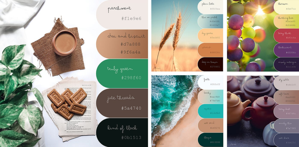
Definition of Color Contrast in UI/UX
In UI/UX, color contrast is the visual distinction between background colors and foreground items (buttons, icons, and text). While low contrast makes material harder to read, high contrast increases visibility.
Contrast in UX design makes it possible for users to easily read text, recognize interactive features, and traverse interfaces.
Why Designers Focus on Color Contrast in UI/UX?
In UI/UX, designers employ color contrast to direct user hierarchy and attention. Important actions like buttons, links, and calls to action are highlighted by strong contrast.
Inadequate contrast might cause users to overlook crucial information, which lowers usability and engagement.
Color Contrast vs Color Choice
In UI/UX, color contrast emphasizes utility while color choice emphasizes aesthetics. If contrast levels are too low for reading, even appealing color combinations may not work.
Why Color Contrast in UX Is Important
Accessibility and Inclusivity
For people with low vision, color blindness, or visual impairments, color contrast in UX is crucial. Everyone can access content thanks to high contrast.
Designers can produce inclusive digital experiences by adhering to accessibility criteria such as WCAG.
Improved Readability
In UI/UX, color contrast plays a major role in text readability. Eye strain is lessened and understanding is enhanced by dark text on a light background or light text on a dark backdrop.
Longer user engagement is achieved by readable interfaces.
Better User Experience
An interface with good contrast is more user-friendly. In UI/UX, color contrast lowers annoyance and raises overall happiness, which increases user retention.
Popular Tools to Test Color Contrast in UX
During the design and testing phases, designers depend on reliable contrast-checking tools to guarantee appropriate color contrast in UX. The Coolors Contrast Checker and WebAIM Contrast Checker are two of the most popular utilities.
WebAIM Contrast Checker
Designers may quickly evaluate text and background color combinations against WCAG accessibility guidelines using the WebAIM contrast Checker. It is a crucial tool for accessibility-focused UI/UX design since it clearly indicates whether your contrast ratio passes or fails for normal and large text.
Coolors Contrast Checker
In a similar vein, designers can experiment with color schemes while preserving appropriate contrast by using the Coolors contrast checker. Because it enables designers to dynamically change colors without sacrificing usability or readability, it is particularly helpful in the early stages of design.
Designers may reliably implement color contrast in UX that complies with accessibility rules, increases readability, and enhances overall user experience across digital products by using tools like WebAIM contrast tester and Coolors contrast checker.
WCAG Guidelines for Color Contrast in UX
Contrast Ratio Standards
The contrast ratio that WCAG suggests is:
4.5:1 for normal text
3:1 for large text
In UI/UX design, adhering to these ratios guarantees appropriate color contrast.
Why WCAG Compliance Matters
Apps and websites that disregard contrast requirements run the danger of legal problems and accessibility problems. In UI/UX, appropriate color contrast keeps businesses compliant.
Tools to Check Contrast
To assess color contrast in UI/UX designs, designers utilize tools such as browser extensions, Figma plugins, and contrast checkers.
Color Contrast in UX for Text and Typography
Text vs Background Contrast
The text must contrast sharply with the background. The user experience is negatively impacted by poor contrast, which decreases readability.
Text is readable on all screens and devices when UI/UX has good color contrast.
Font Weight and Contrast
Higher contrast levels are necessary for thin fonts. For best clarity, UI/UX designers must balance font and color contrast.
Avoiding Low-Contrast Mistakes
One typical error is to use light gray lettering on white backgrounds. Contrast should always be tested in various lighting scenarios.
Color Contrast in UX for Buttons and CTAs
- Highlighting Interactive Elements
Buttons ought to be easily noticeable. Users can quickly identify clickable items in UX when there is a strong color difference.
- CTA Visibility
High contrast is necessary for call-to-action buttons to encourage conversions. Click-through rates may be lowered by poor contrast.
- Hover and Active States
To preserve usability and accessibility, contrast should be unobstructed during hover, focus, and active states.
Common Mistakes in Color Contrast in UX
Relying Only on Color
It is dangerous to utilize color alone to communicate information since different people have different color perceptions. In UI/UX, color contrast should always be paired with supporting elements such icons, text labels, patterns, or shapes to increase accessibility and clarity.
Ignoring Dark Mode
To guarantee constant usability, designs must maintain appropriate contrast in both bright and dark settings.
Overusing Bright Colors
Eye tiredness may result from excessive light. Contrast should be balanced without overpowering consumers.
Best Practices for Color Contrast in UX
- Test Early and Often
To prevent usability problems later, test color contrast in UX throughout the design stage.
- Design for All Users
When selecting color combinations, always take accessibility, color blindness, and visual impairments into account.
- Maintain Brand Consistency
Make careful use of brand colors while making sure there is enough contrast for engagement and readability.
Future of Color Contrast in UX (2025 Trends)
AI-Assisted Accessibility
By assessing interfaces in real time and recommending accessible color combinations, AI systems now assist designers in automatically optimizing color contrast in UI/UX designs. These technologies forecast readability problems, identify low contrast locations, and suggest enhancements using machine learning.
Personalized UI Themes
Contrast levels can be changed by users to suit their tastes, which enhances accessibility and general comfort when using digital items. Users with light sensitivity, aging eyesight, or visual impairments can read information more readily thanks to features like high contrast options, dark mode, and configurable color settings.
Conclusion
In UI/UX, color contrast is a necessity for usability and accessibility as well as a design decision. Appropriate contrast has a direct impact on user pleasure and engagement, from enhancing readability to guaranteeing inclusion. By 2025, designers that put a high priority on color contrast in UI/UX will improve digital experiences, satisfy accessibility requirements, and foster user confidence.
FAQs
1. What is color contrast in UX?
Color contrast in UX refers to the visual difference between foreground and background elements to ensure readability and accessibility.
2. Why is color contrast important for accessibility?
It helps users with visual impairments read content and interact with interfaces easily.
3. What is the ideal contrast ratio in UX?
WCAG recommends a minimum ratio of 4.5:1 for normal text and 3:1 for large text.
4. Can poor contrast affect conversions?
Yes, low contrast reduces usability and can lower engagement and conversion rates.
5. How can designers test color contrast?
Designers use contrast checker tools, design software plugins, and accessibility audits.

